From walk-in closets to stainless steel appliances, fireplaces and custom cabinets, the list of coveted features in a house are endless. But, what about the elements that make a space ‘age-friendly’ and ‘inclusive’?
More and more people are prioritizing accessibility when looking for a place to call home. Further, as the population ages, age-friendly communities are a necessity.
Statistics Canada 2019 data indicates that about 6.5 million people are 65 years and older in Canada and account for 17.5% of the population. The proportion of seniors in the population is expected to double by 2025.
With this in mind, what does it mean to have an accessible home?
DeafBlind Ontario Services, an Ontario-based not-for-profit, aims to raise awareness about large and small-scale projects to improve the accessibility of a space in their Accessibility Guidelines for Sensory Loss.
The newly released third edition of Accessibility Guidelines for Sensory Loss, was developed by DeafBlind Ontario Services with the accessibility needs of individuals with deafblindness, a combined loss of hearing and vision, in mind. However, this free for download resource can benefit anyone with sensory loss, including Canada’s aging population.
According to the Canadian Institute of Health Information (CIHI), 22% or 70,080 of Ontario seniors in home care and long-term care reported experiencing vision and hearing loss combined.
“The purpose of this tool is to share guidelines and provide helpful tips that focus on establishing inclusive environments for individuals with varying sensory loss. Inclusion of accessible features and design emphasizes efficient environments, space maneuverability, the importance of illumination, and the use of colour, texture, as well as specialized materials to name a few,” says Kelly Patterson, DeafBlind Ontario Services’ Manager of Client Services and Specialized Training.
Contrary to popular belief, accessible design does not need to be expensive and may esthetically enhance a space.
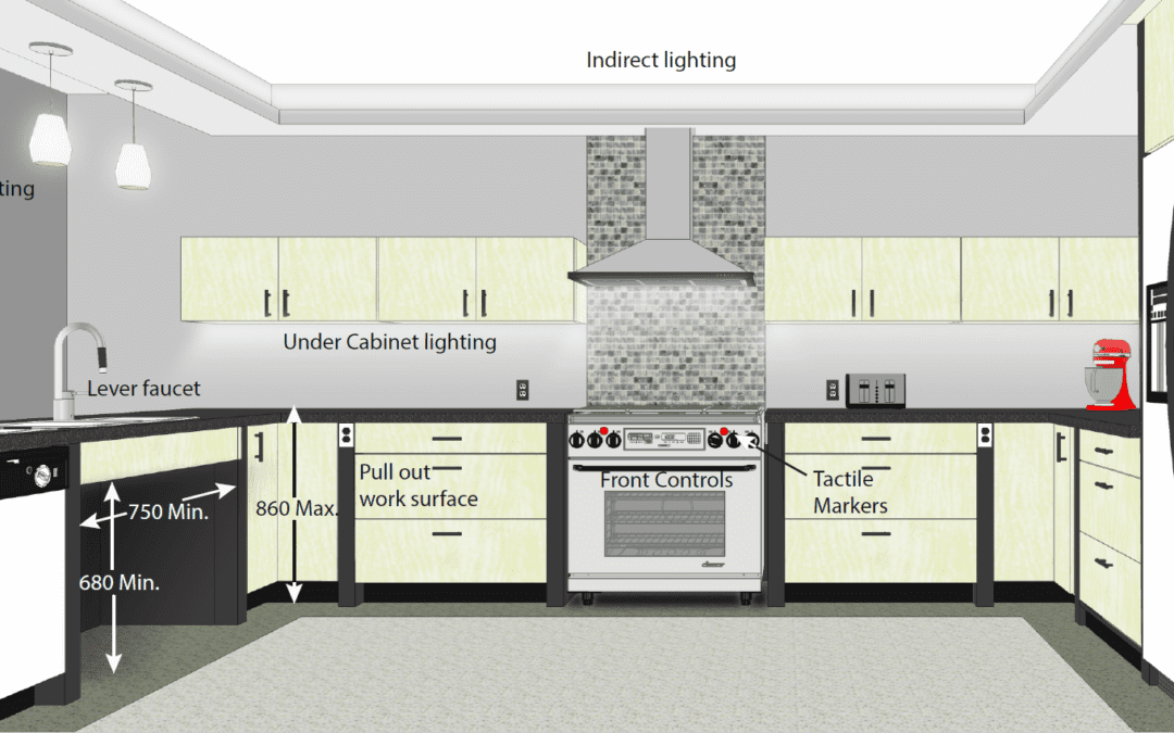
When looking at a kitchen, for example, there are a number of factors that can improve accessibility, ensuring that the space is functional and safe. Some of these factors include: efficient design, maneuvering space for mobility devices, minimal effort of use, ease of cleaning, illumination, and safety.
When designing kitchens, colour schemes need to be taken into consideration from the onset. Well thought out colour schemes in kitchens assist with defining the features and enhancing the ability of those with low vision to understand and discern the features in kitchen environments.
Light-coloured flooring schemes could be cream, white, or a light grey with defined perimeters of colour contrasting material, such as baseboard a minimum of 100 mm wide when combined with light-coloured walls.
An alternate colour scheme to consider is dark-coloured flooring, light coloured cabinets, dark counters, light backsplashes, dark coloured drawer pulls, dark-coloured walls with light coloured outlets on the wall and light coloured trim.
One simple home improvement in the kitchen can include changing cabinet handles. These should be selected in a contrasting colour to the cabinetry and a “D” type pull is recommended.
The Accessibility Guidelines for Sensory Loss, free for download on DeafBlind Ontario Services’ website, features comprehensive Accessible Design Guidelines, Quick Design Tips, and a Do-It-Yourself (DIY) Accessibility Enhancements section to provide readers with all of the information necessary to improve the accessibility of a specific space.
“Together, we can proactively breakdown barriers to make an environment safer, accessible, and inclusive to everyone in it,” says Patterson.
Learn more at https://deafblindontario.com/our-services/accessibility-guidelines/


Recent Comments